

Cocagne
Delicious cuisine prepared by Rachel and Fabien Lefebvre
Fifteen minutes north of Béziers, the Cocagne restaurant is launching a new culinary venture led by Rachel and Fabien Lefebvre.
Located in the heart of Château Autignac, the restaurant specializes in contemporary, hearty Mediterranean cuisine. To reflect this sensibility, we approached the visual identity as a setting: a design rooted in the location, conceived to complement and enhance the experience rather than overshadow it.
This project is a natural extension of our collaboration with Fabien, which began when we designed the packaging for Maison Alaryk’s liqueurs.




An Identity That Enhances the Experience
The space is organized around a twelve-seat counter, designed as a place for sharing. This shape—almost like a smile—inspired the typographic structure of the logo. The choice of the Maroni typeface, published by the Calame Bureau type foundry, lends the brand identity a warm feel that perfectly resonates with the spirit of the place.
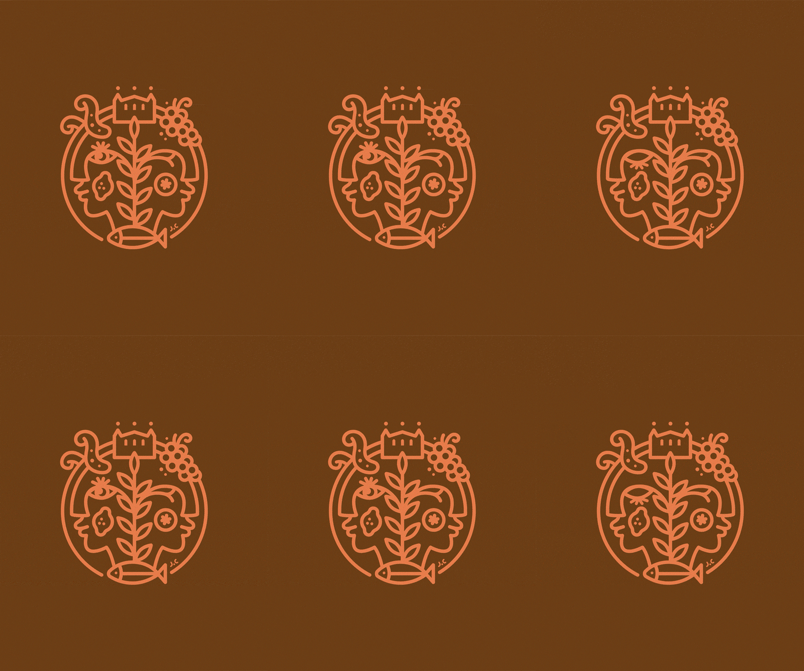
The logo, inspired by the work of artist Jacques Charvet, features the duo Rachel and Fabien as well as the ongoing dialogue between the kitchen and the wine cellar. Featuring octopus, lemon, grapes, basil, and fish, the logo reflects Fabien’s seasonal and Mediterranean cuisine, which is elevated by the food-and-wine pairings carefully curated by Rachel.
As is often the case at the studio, the logo’s design is a simple, recognizable gesture, created to be put to practical use. Here, it becomes a culinary marker that Fabien incorporates even into his dishes, transforming them into his signature using a stencil.


An evolving identity, just like the menu
At Cocagne, the menu changes with the market. So we designed a permanent menu holder that can accommodate an updated menu for each service, reflecting the dynamic nature of our cuisine.
The stationery, carefully printed on Fedrigoni Woodstock paper, features the visual identity’s color palette: a warm brown, a luminous coral, and motifs inspired by the term “Cocagne.”
A concept designed to support the site over time, in line with our approach, creating sensitive, evolving identities rooted in their context.


